The business expanded from a structured program into a flexible a la carte Meal Club subscription, requiring an account experience redesign to handle both user paths seamlessly. Moving toward a modular dashboard created a unified experience that adapts to show either program-specific milestones or a la carte benefits based on the plan type.
Objective
Improve the customer experience for managing recurring orders across both structured plans and flexible a la carte subscriptions.
Role
User experience manager, contributing designer, project manager
The page was reorganized with flexible modules to serve the needs of both structured plan and meal-club customers and reduce development time.
Initial data showed that a long, untruncated list of items pushed critical account links so far down the page that 70% of users never saw them. This led to high customer support volume for tasks that should have been self-service.
Smart Truncation: Replaced the full order list with a preview module, bringing high-frequency management links above the fold to ensure they are accessible without excessive scrolling.
Information Hierarchy: Established distinct typography and styling to break up the previous “wall of text,” allowing users to scan and find their shipment or payment details instantly.
Business-Aligned Logic: Integrated the delay order function into the summary module rather than a standalone section. This satisfied the user need for flexibility while maintaining the stakeholder requirement to protect recurring revenue.
To support the new business model, we needed a way to encourage members to explore more of the menu without adding friction to their management flow.
One-Tap Upsells: Designed an “Add Additional Meals” module that allows users to seamlessly add seasonal or top-rated items to their recurring order with a single click.
Contextual Placement: Positioned discovery options directly within the natural path of the dashboard, making it easy for users to customize their boxes while reviewing their shipment.
The interface focuses on high-frequency tasks, removing friction from the monthly maintenance flow.

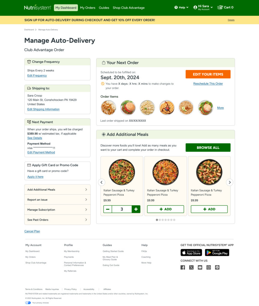
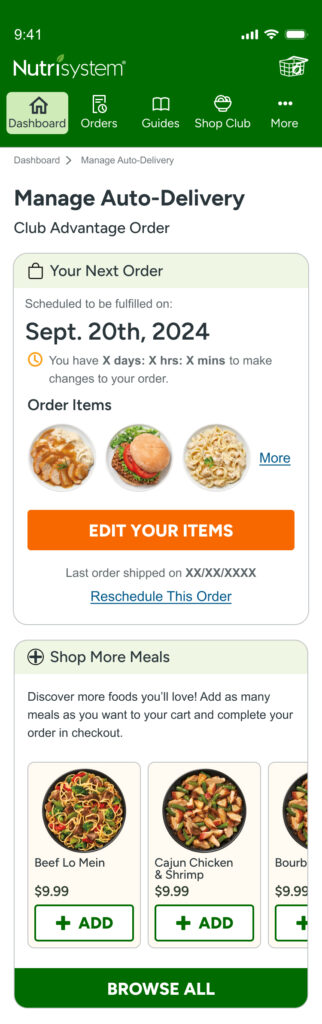
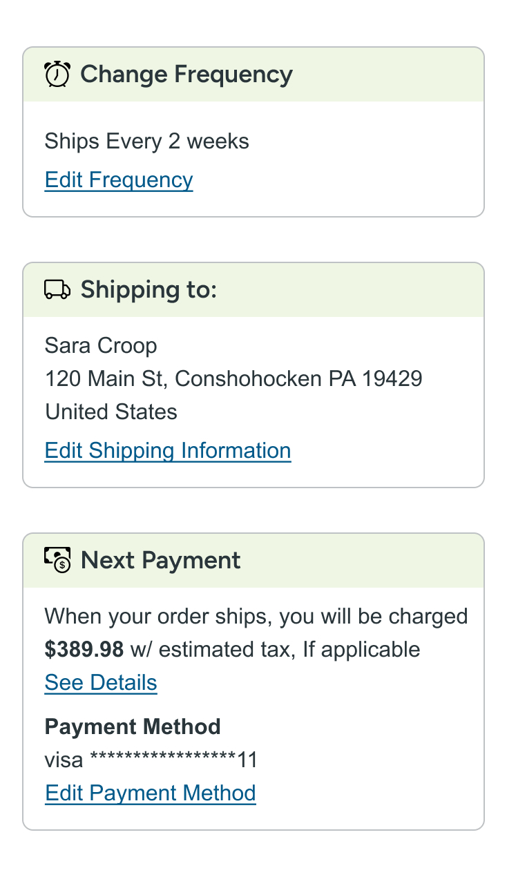
High-frequency actions were moved to the top of the page allowing users to update their shipment and payment details without digging through menus.

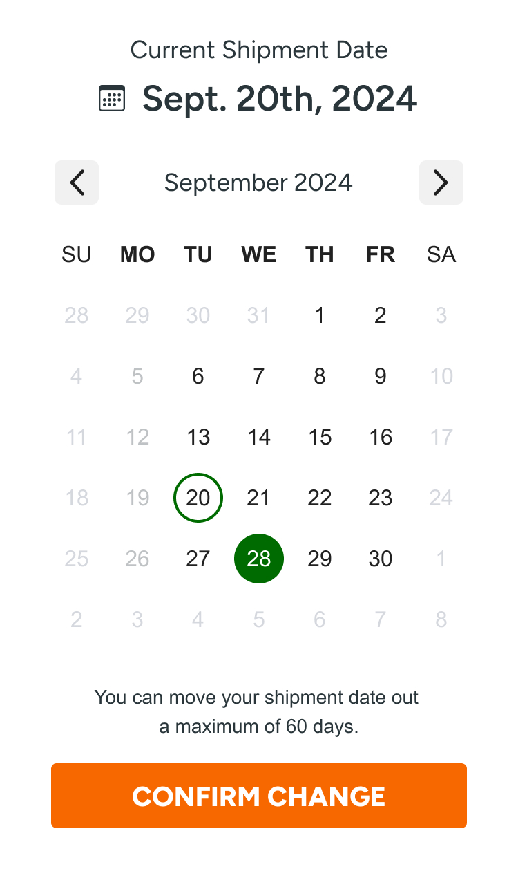
The shipment calendar was converted from a four-step process into a single, intuitive interaction.

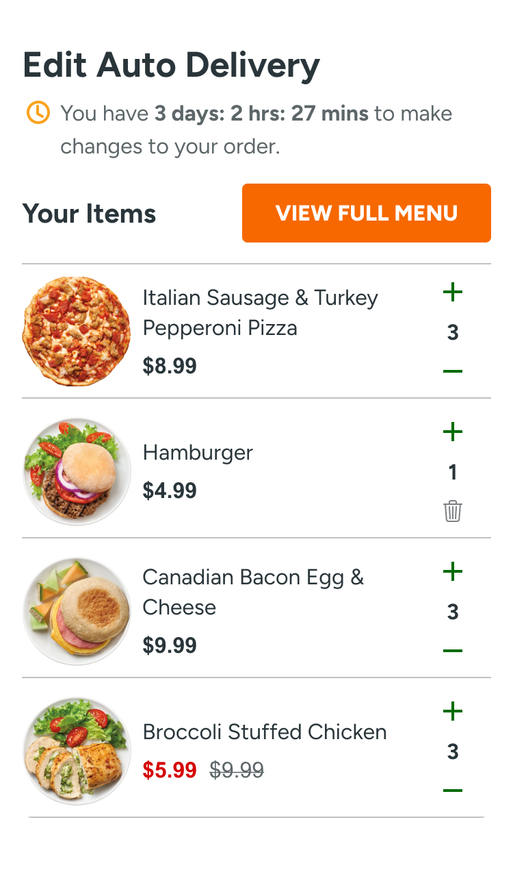
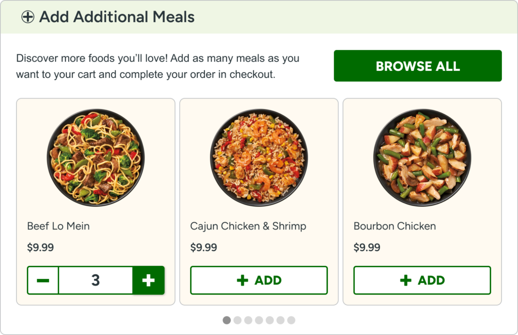
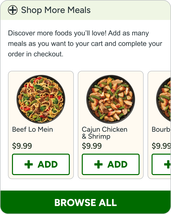
One-tap quantity adjustments allow users to refine their orders instantly without leaving the page.
Redesigning the mobile hierarchy reduced the friction associated with monthly order maintenance, successfully balancing user efficiency with business revenue goals.
Improved Discoverability: By truncating the food list into a preview module, core management links were moved above the fold, addressing the issue where 70% of users previously failed to scroll to critical functions.
Reduced Support Volume: Streamlining the primary navigation allowed members to handle basic account tasks independently, decreasing the frequency of customer service calls for simple order updates.
Strategic Retention: The delay order function was integrated into the summary module as a strategic compromise, providing the necessary user control while protecting recurring revenue as requested by stakeholders.