When Jenny Craig added more choices to their program, we needed to make the selection process easier to follow and less overwhelming for the customer. The updated experience resulted in a 3% increase in program orders.
Objective
Reduce decision making fatigue and user confusion around program options
Role
User experience manager, UX research, UX designer
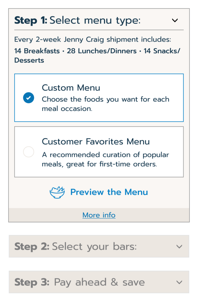
Option Stepper Model
One decision at a time provides more focus
Through prototyping, live testing, evaluating and retesting a solution was found that provided a smooth experience and an increase in program purchases.
Problem 1
Expansion of program options
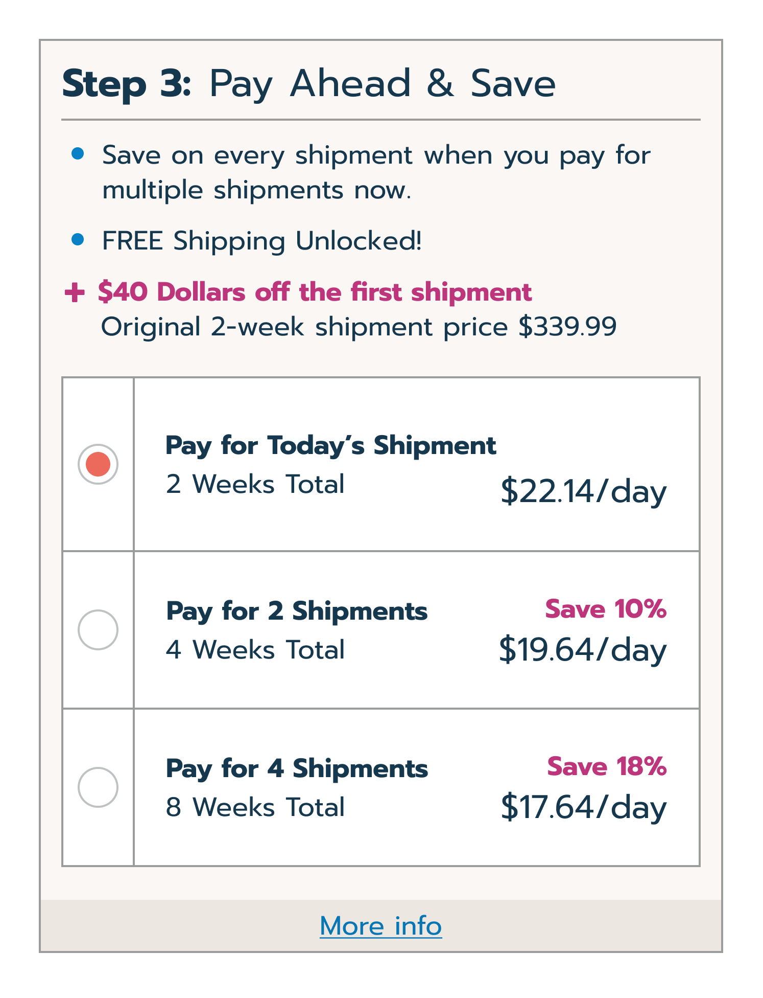
Adding additional options for bar and payment selections made the order section long and unwieldy. Separating each decision into its own collapsible section proved to be helpful in focusing the customer and moving them through the page.
Problem 2
Desktop Layout
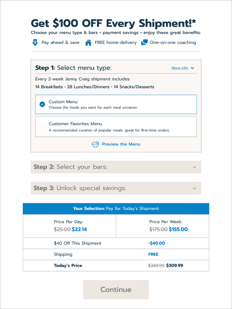
Initial testing showed very positive results on mobile but not on desktop. We decided to further simplify desktop even more by reducing to a single column and removing excess imagery and graphic elements.
Solutions
Help the customer understand the product
Upgrades to overlays and pricing information gives the user a full picture of the program.