Sara Croop

Jenny Craig

Program Companion
Tracking App

Project Goal

Design an easy-to-use tracking app for a new e-commerce model

Jenny Craig needed an app to support their shift to e-commerce that would help customers understand and follow their meal plan without in-person coaching support.

Objective

Create a companion app for Jenny Craig customers to learn, follow, and track their meal plan.

Role

User experience manager, UX research, strategic decision making, end-to-end design

Context

The app also needed to function as a white-label platform, sharing a codebase with Nutrisystem while maintaining Jenny Craig’s distinct brand. This shaped every structural and system decision.

Final Product

Journal Tracking

Based on research from actual customers, a completely new journal was designed that makes daily goals visible and logging effortless.

Key Features at a glance

Daily goals panel

Users see a calorie meter and empty dot indicators at the top of their journal representing each food category. As they log food, the dots fill to show progress for the day.

Food logging

A prominent log and scan button opens a simple logging flow. Each food shows how it counts toward daily goals before the user commits to logging it.

Quick log

Water and activity goals live alongside food tracking and can be logged with one tap directly from the journal.

User Research

High engagement, low comprehension

An existing food tracking app had real users and real friction. Before building two new apps from the ground up, users were surveyed to understand what wasn’t working. 

Activities conducted:

  • Survey of 250 existing app users on usability and features
  • Customer service feedback on recurring issues and agent observations
  • App store reviews and community posts analyzed for patterns

Key insights:

  • 85% of users logged food more than once a day, making the journal a high-frequency touch-point
  • Only 46% understood the plan well, pointing to a critical clarity gap
  • Scan and search were the most preferred logging methods, but both had friction
  • Weight logging happened far more often than expected, which informed navigation decisions
  • Top pain points: not knowing what to eat, confusion about food categories, unreliable search
Design Strategy

Flexibility built into the foundation

To support the shift to an e-commerce model, the project transitioned to a common platform with a shared codebase. This scalable architecture allowed for simultaneous feature deployment across multiple brands while preserving unique visual identities.

Developing a Multi-Brand Design System

  • Multi-Brand Design System: Built a modular Figma library where brand specific themes like colors, typography, and icons could be swapped at the component level.
  • Scalable Architecture: Established a framework that reduced development handoff and allowed UX improvements to be rolled out across the entire portfolio instantly.

Optimizing Plan Understanding

Mapping the User Journey

Before moving to high-fidelity designs, whiteboarding sessions were utilized to audit and refine the user journey. By architecting a more linear and guided experience, the path from food selection to successful logging was significantly shortened to reduce friction and cognitive load.

This logic informed the development of a modular home screen that adapts to individual needs:

  • Dynamic Personalization: Smart logic displays specific modules based on user state and history.

  • Guided Onboarding: Instructional videos, dedicated modules, and timely notices to direct users toward their next steps.

  • Efficient Workflows: Long-term users are presented with the barcode scanner and quick-log tools immediately upon opening the app.

  • Contextual Relevance: Tailored views ensure the most relevant tracking tools are always front and center, minimizing unnecessary navigation.

A whiteboard sketch of a menu layout with annotations is shown above several card-like UI components featuring icons, titles, and messages. Arrows illustrate the transition from sketch to digital components.

Prioritizing Inclusive & Accessible Design

With a significant portion of the Jenny Craig user base falling into the 50+ demographic, it was vital that the app  functioned as a tool rather than a barrier.

Typography & Contrast: High-contrast ratios and legible font pairings were prioritized to support system-level font scaling for improved readability.

Dark Mode Support: The introduction of an accessible Dark Mode provided a high-contrast alternative. This was a functional choice to reduce eye strain for users tracking meals in various lighting environments.


Validation

Testing user comprehension

Different visualization ideas were evaluated to find the most intuitive way for users to track their daily progress.

  • Preference Testing: The “Dots” system was selected after outperforming other concepts in clarity and ease of use during unmoderated sessions.

  • Actionable Results: Feedback from real users helped refine the logging flow, ensuring the interface felt easy to use from the very first day.

Implementation

Help users understand their daily meal goals

To support the shift from in-person coaching to a digital e-commerce model, the app was designed to act as a proactive guide rather than a passive tracker.

Pre-Configured Goals

Daily nutritional targets populate automatically based on the user’s specific plan. As the user loses weight, these targets dynamically recalibrate to ensure the program remains accurate. This automation removes the need to manually calculate requirements or memorize complex rules while logging.

Visual Goal Tracking

  • The “Dots” System: Empty dots provide a clear mental map of daily needs at a glance.

  • Positive Reinforcement: Filling in dots gives immediate feedback on what has been accomplished and what remains to be eaten.

Streamlining the logging journey

The logging flow was rearchitected to prioritize speed, providing multiple paths to entry without sacrificing program accuracy.

  • Multi-Modal Entry: Combines database search, barcode scanning, and one-tap category logging into a single, cohesive flow.
  • Effortless Verification: Displays exact portion counts and nutritional data directly in the search results to eliminate guesswork.

Solutions

Quick access to most-used functions

The interface prioritizes high-frequency actions to simplify plan management while balancing core business requirements.

A health tracking app dashboard showing 6 new messages, 1700 calories left, 26 oz water consumed out of 60 oz, 26 min activity out of 60 min, current weight 204.25 lbs, goal weight 180 lbs, and 20 lbs lost in 14 days.

Home Dashboard

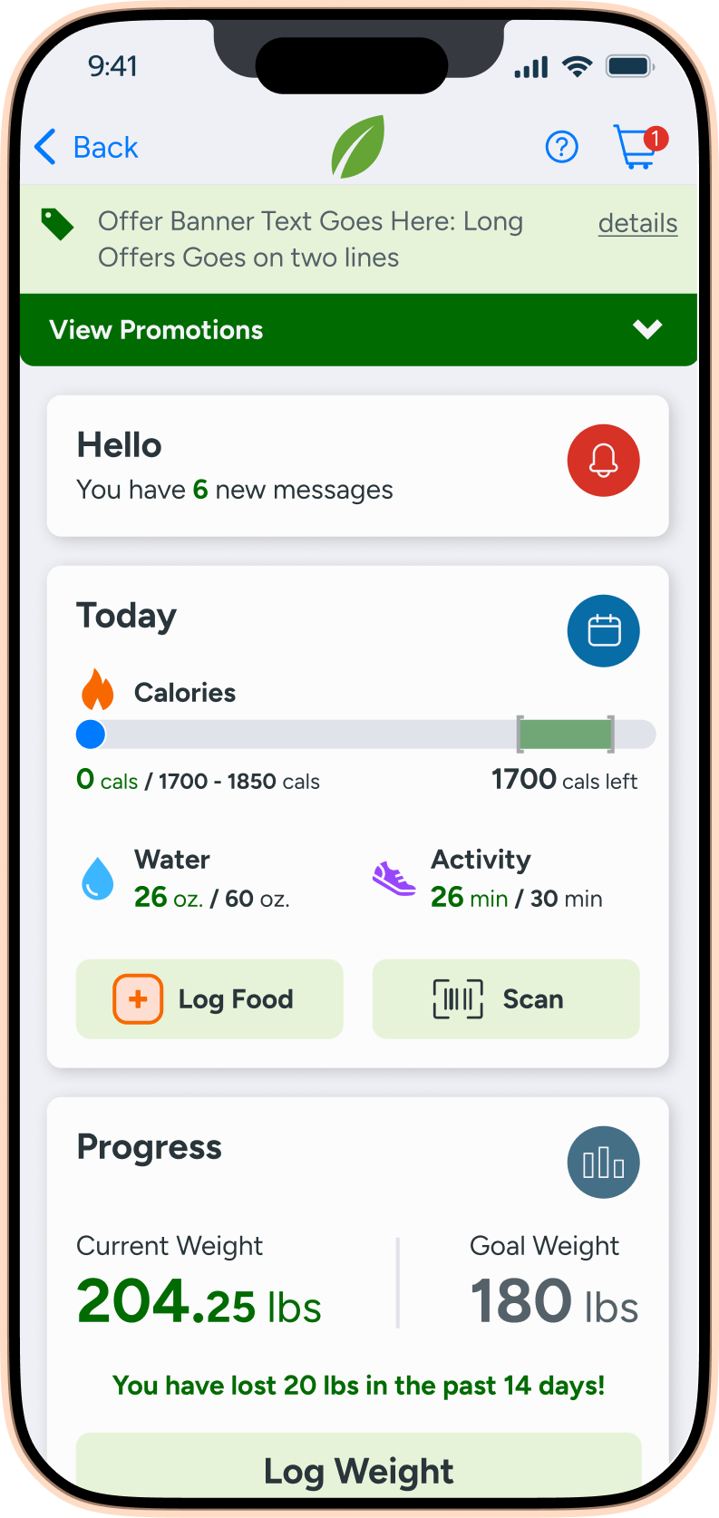
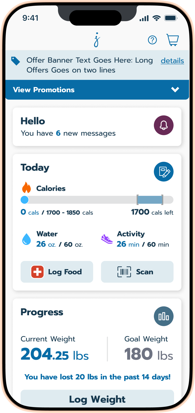
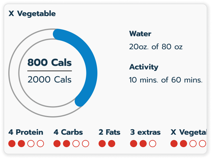
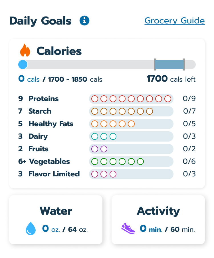
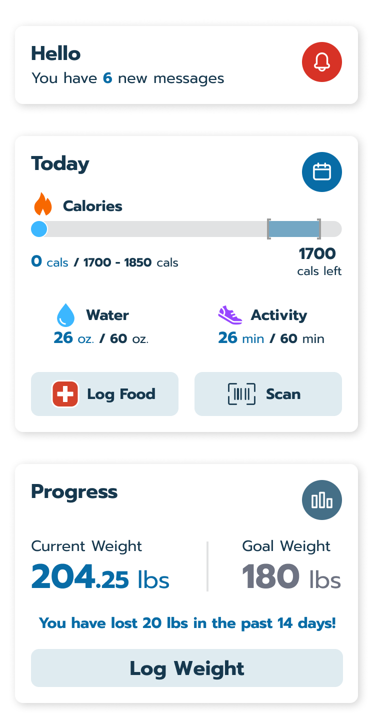
Modules provide a daily snapshot of goals for nutrition, weight, and activity.

A food logging app screen displaying Classic Waffles with 350 calories, 2 proteins, 2 starches. Serving size is 1 package, meal time is breakfast, date is today, and there’s a red Log it button at the bottom.

Intelligent Entry

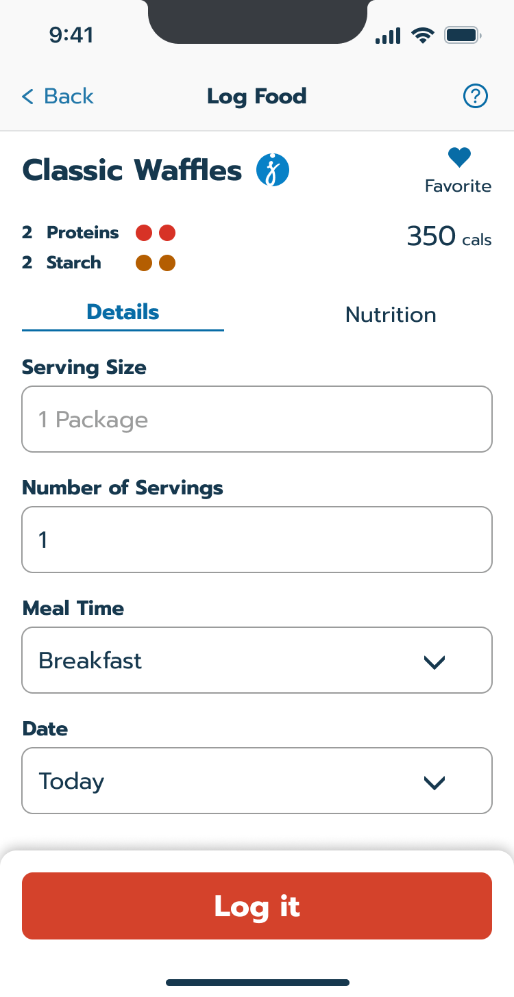
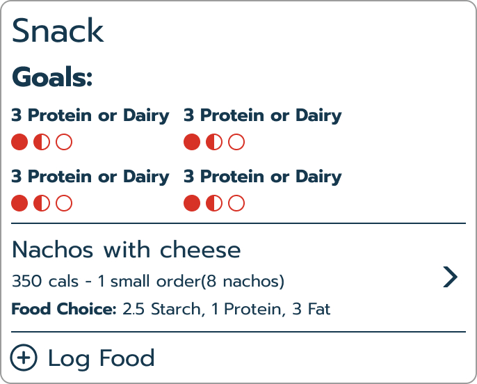
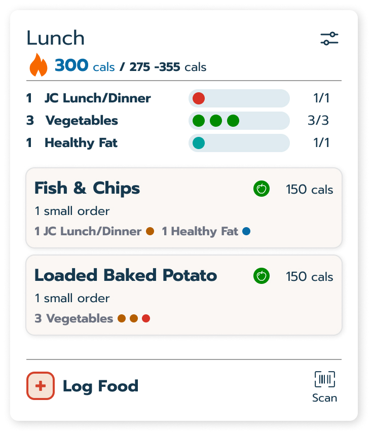
A simplified flow shows how food counts toward daily targets before committing to a log.

Quick log food category list

Quick Log

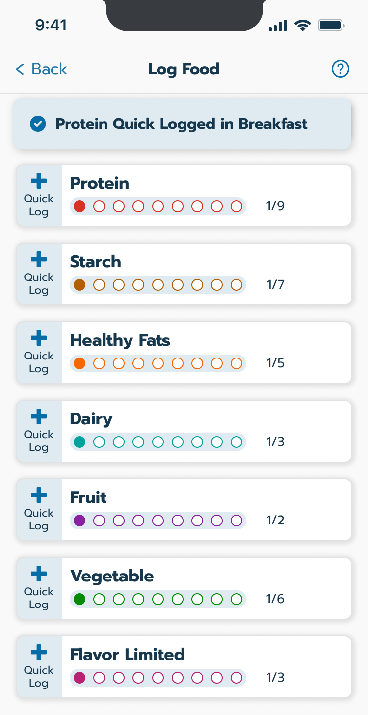
A one-tap system records specific categories without needing to search the database.

Impact

Transitioning to a digital-first experience

The new app provided the critical infrastructure needed to update the brand from in-person support to a digital-first subscription model.

  • Reduced Cognitive Load: Automated the most difficult parts of the program, leading to more consistent daily engagement.

  • Scalable Framework: Created a modular design system that allowed for rapid updates across multiple brand platforms.

  • Successful Pivot: Successfully bridged the gap between physical food delivery and a self-sufficient digital experience.